Omar Shehata
How to turn an image black and white
From Omar's notebook.
An easy way to turn an image black and white is to average all the colors. I've always known this wasn't "the right way" to do it, but it was usually good enough for my needs.
While reading Foundations of Game Engine Development I learned about the more sophisticated way to do it, where you take into account the fact that our eyes are most sensitive to green, followed by red, followed by blue.
How big of a difference does this make? Could I actually notice it myself if I try it on a few different images? Are there cases when it doesn't really matter? And are there other ways to represent an image in black and white that may be better depending on the input?
I created this page as a sandbox to help me explore these questions.
Comparing the two methods
Click on the tabs above the code editor to compare the original image, the averaging approach, and the more correct approach.
You can use your own image here. Paste a URL above, drag and drop it in the code editor, or click here to upload. You can find a lot of great photos on Unsplash.
Exploring the sandbox
You can see exactly what it means to turn an image black and white by "averaging the colors" by clicking on tab 2 and looking at the code.
The language used is GLSL. You can change the code and it'll re-run as you type. Here's a reference to built-in functions. Errors will only appear in the browser console.
What does it mean for an image to be black and white? Each pixel must only be represented with a single number (brightness) instead of 3 (red, green, blue). So any algorithm must decide how to choose this 1 value given the 3 color components.
What makes a better algorithm? I discovered this by going backwards: I looked at the result of the two algorithms on a lot of pictures, compared to the original color image. My conclusion: the better black and white algorithm will produce a result that looks closer to the original color image.
Here are a couple other ways to turn it black and white that you can paste into one of the tabs:
Finding the better algorithm
To me, tab 3 certainly looks brighter than tab 2, but it's unclear that this is "closer to the original image". What tab 3 is doing is heavily weighting the green component, and taking very little of the blue. These coefficients come from the sRGB standard.
Perhaps this makes it brighter here because this particular image has a lot of green? I tried replacing it with this image of a hot dog, which has very little green. I was surprised the difference between tab 2 & 3 was more obvious!
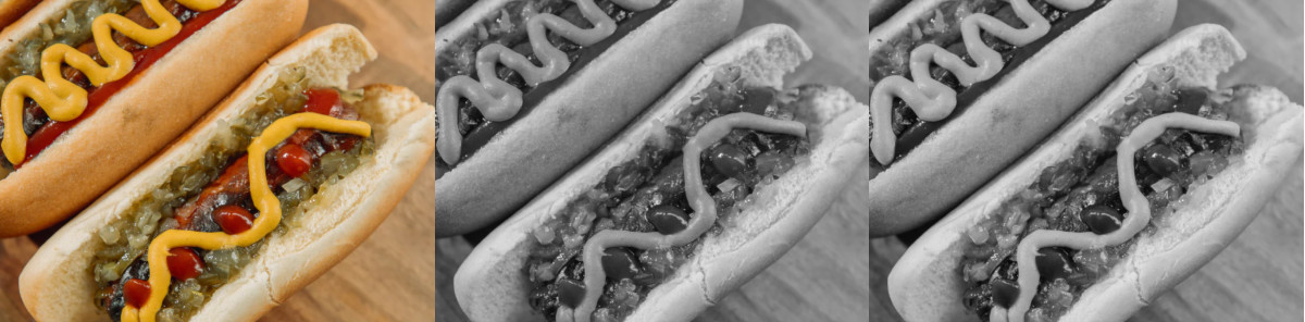 Photo by Ball Park Brand on Unsplash
Check out that mustard.
My initial reaction was that tab 2 looked like it had more detail. I could see the highlights and shadows on the mustard more clearly compared to tab 3, where those details looked washed out.
But looking back at the original image, those details aren't there, or at least not easily visible. Which means those details revealed in tab 2 are actually an artifact of the algorithm, not a detail present in the original photograph.
This is an example of what it means for tab 3 to be a better representation of the original image in black and white.
The other example that convinced me was this image of meatballs and spinach.
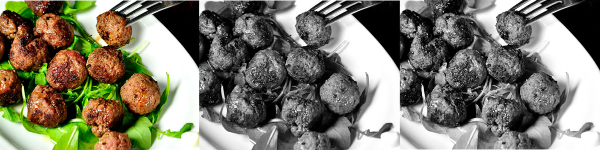 Photo by Emiliano Vittoriosi on Unsplash
Look at the spinach. It's clearly brighter in tab 3. More importantly, the spinach appears much brighter than meatballs in the original. This contrast is preserved in tab 3 much more than in tab 2.
This is easier to see by loading this image in the sandbox and flipping between the tabs. Remember you can do this by going to the image on Unsplash, right click, copy image address, and paste it above.
What does this say about our eyes?
What's really interesting to me here is that this algorithm is actually accounting for an "artifact" in our eyes. In the last image, the spinach isn't actually that bright. It just appears bright because it's green.
If we frame it this way, then the black and white tab 2 image is how the original is supposed to look like. Or at least, how it would look like if our eyes were equally sensitive to all colors.
This quirk of our biology means that the optimal algorithm isn't some beautiful symmetric formula. It's empirically derived. How do you make an image black and white? Take ~70% of green, ~20% red, and the rest is blue. It's messy. It's ugly. It's human.
And I just love that. And that's why I love computer graphics as a field so much.
This also makes me wonder about the variation in human biology. Are there people for whom there is a different set of coefficients that is more optimal?
A final question
I'll leave you with this: what happens if we turn this image black and white? What should happen?

This image represents 3 lights that are pure red, green and blue. They are all equally bright. But our eyes don't see them as equally bright.
Edit: gamma correction
A few folks on Reddit pointed out that this article isn't taking into account gamma correction. I wasn't sure if this was necessary and what color space my browser/WebGL/my monitor were using. But using the snippet below, the black and white image looks even better!
Specifically, on the hot dog, the ketchup appears much brighter, which is closer to how it looks in the original.
The TL;DR of gamma correction is that old CRT monitors did not have a linear relationship between the color signal sent to it and how bright it displayed. An intensity value of 0.5 would appear at 22% brightness (much darker than the intended 50%). A lot of current systems still maintain this relationship for consistency. But also the human eye perceives brightness in a similar relationship? Here's a good article on gamma correction.